
Anni Branding
BRANDING + CW: ANNI’S, ME & CHATGPT
BUSINESS OVERVIEW
Anni was created from a space of love and wonder by two best friends (Annie & Annika). They sought to create a brand around a collection of crystal-filled, heirloom keepsakes to help launch those adorning these precious pieces into the present moment. To pause, to step out of the circle of time, and into the circle of love.
THE PROBLEM
In an era where cell phones and smartwatches have become ubiquitous extensions of daily life, a subtle yet profound societal problem has emerged – the disconnection from our authentic selves. While individuals may appear more connected than ever through the screens in their hands a crucial question arises: How deeply connected are people to their true selves?
While gadgets promise connection, they often deliver a mere illusion of it. The more individuals immerse themselves in the digital realm, the further they drift from moments of genuine self-reflection. Amidst the relentless pings and alerts, there is a risk of losing touch with thoughts, emotions, and the vital essence of what makes humanity uniquely human.

BRAND MISSION
In a world dominated by technology, where products tether people to a constant stream of notifications and distractions, it's easy to lose touch with the essence of our own existence. Anni’s crystal-filled keepsakes offer a unique and tangible solution, a powerful reminder to break free from the digital noise and reconnect with the present moment.
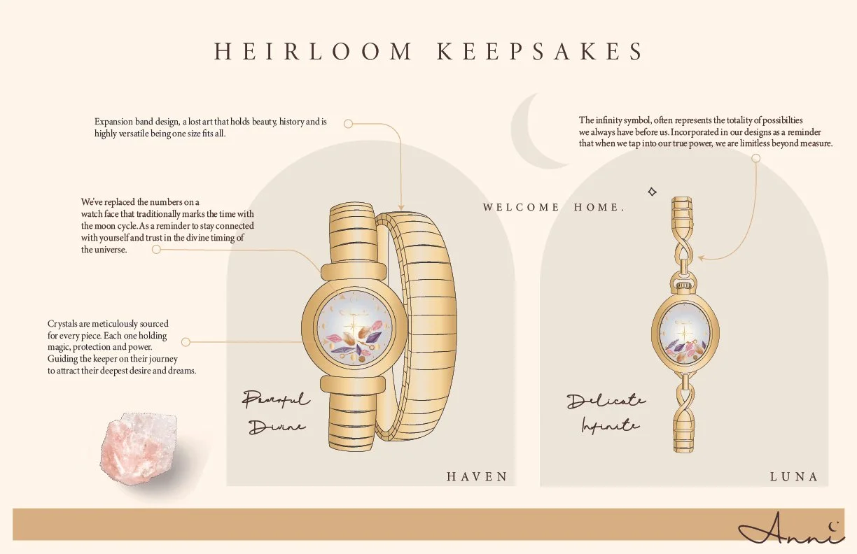
Embedded within each timepiece are carefully selected crystals known for their calming and grounding properties. These crystals act as gentle anchors, helping to center the wearer and encourage mindfulness.
LOGO
The logo has a light and whimsical aura, characterized by a feminine touch in its hand-written typeface. It evokes qualities such as authenticity, warmth, and humanity. This can help foster a sense of emotional connection and support for individuals as they navigate their journey towards self-discovery and reconnection.
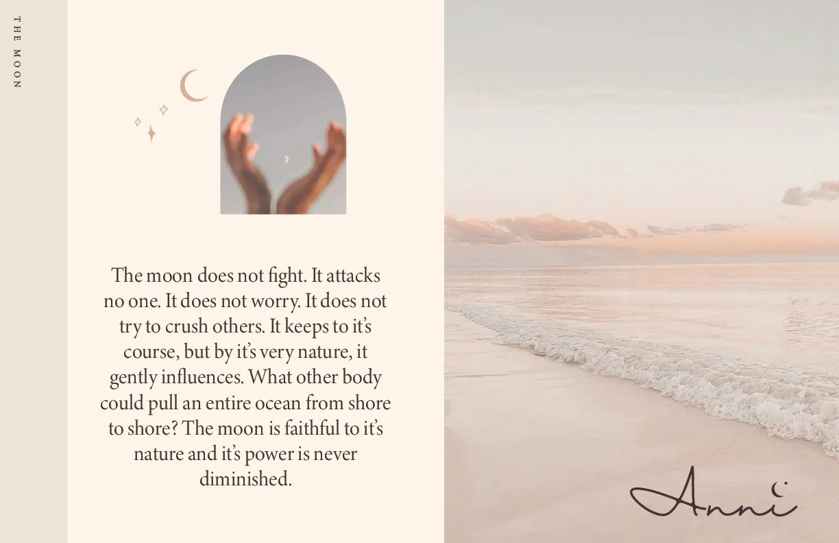
The inclusion of a moon above the "i" serves as a nod to it’s profound significance in various spiritual and cultural contexts, symbolizing numerous facets that resonate with individuals seeking guidance and connection with the universe.
To keep the surrounding area free of additional elements, the designated clear space is equal to the width and height of the letter "x" to ensure the logo's integrity is maintained.
LOGO VARIATIONS & GUIDELINES
The default Anni logo features the Anni wordmark in dark brown. For optimal impact, the dark logo can be showcased against a white or light-colored background. Conversely, the light tan version can be employed when placed on dark or busy backgrounds. The “A” or moon icon is utilized as a compact representation for digital platforms, browser tabs, or situations where space is limited. Preferably, when there is already a brand following.

BRAND AESTHETIC
Anni's brand aesthetic is a harmonious blend of warm earthy tones and soothing neutrals, meticulously curated to evoke a profound sense of love and wonder. Infused with subtle elements of witchcraft, the brand invites you into a realm where each product or experience acts as a conduit connecting you to the vast energy of the universe.
Feminine in its essence, Anni's brand encapsulates not just a visual appeal but a spirited energy. It radiates with a dynamic and lively quality, reflecting the vibrant nature of life and the cosmos. There's a serene undercurrent, a tranquil layer that runs through the brand, inviting individuals to pause, reflect, and find solace in the midst of life's whirlwind.
The free-spirited charm is an invitation to embrace authenticity and individuality. It encourages a liberated and open-minded approach to life, mirroring the unrestricted beauty found in the natural world.
ANNI PITCH DECK
Some pages pulled from Anni’s pitch deck that Annie & Annika put together, using the brand assets I created.


ANNI PRODUCTS: V1
Here’s a sneak peak at the first products and their packaging to come out of production.


