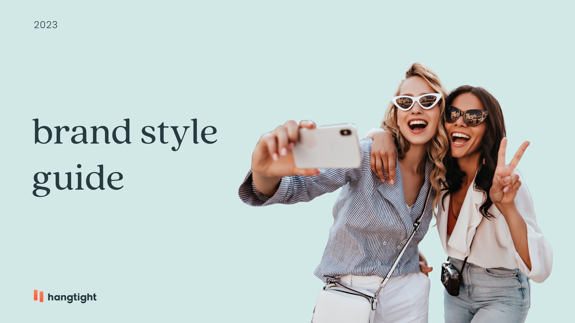
Hangtight App
BRAND DESIGN + ART DIRECTION
Hangtight is an AI-powered social planning app with the mission of bringing le busy people together. I joined the startup as the app’s launch was fast approaching and a visual identity had yet to be identified. I was tasked with developing a comprehensive brand strategy and crafting a brand spanking new visual identity that aligned with our brand positioning. As collaborations with the Head of Product & Design, and the product design team were taking place to ensure a cohesive and compelling user experience on the app, the economical ramifications from the pandemic had made it challenging for the founders to secure needed moola, which in turn led to the brand work to be tabled until further investor interest. But hey, that’s showbiz, baby.

BRAND AESTHETIC
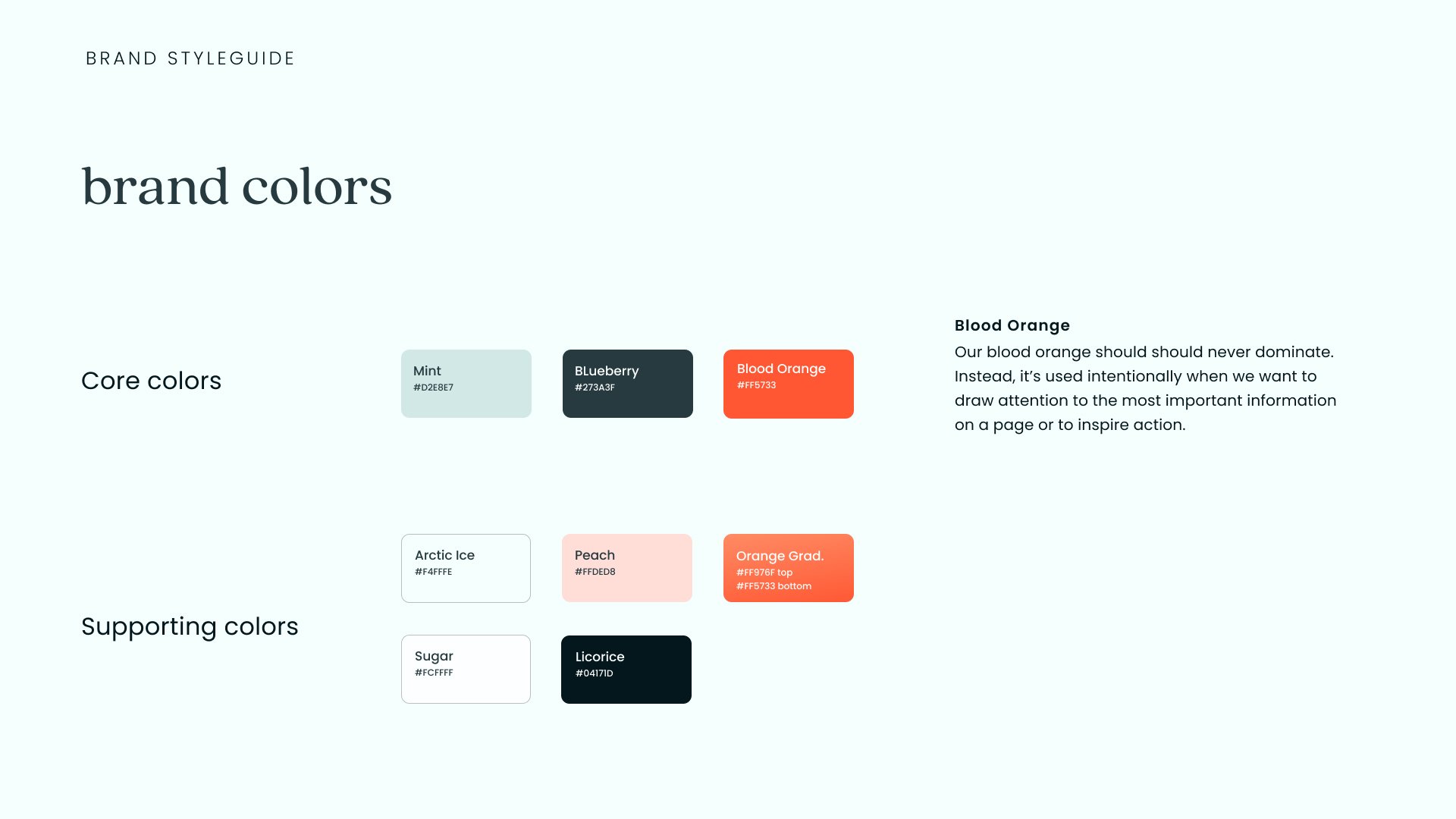
The aesthetic is meticulously crafted to resonate with our audience of young professionals, students, and busy families aged 20-40 who struggle to find time for social connections. The fresh, clean design embodies a sense of calm and clarity, making planning feel effortless amidst their hectic schedules. The pop of vibrant orange adds a touch of excitement and energy, while complementary light and dark teal create a harmonious and welcoming atmosphere, encouraging users to seamlessly integrate social activities into their lives.
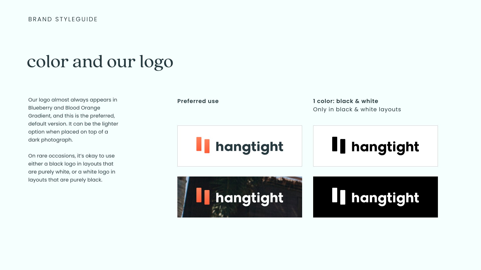
LOGO
Clean, fresh, friendly, and dynamic—that’s kinda how I prefer most of my hangouts with friends.
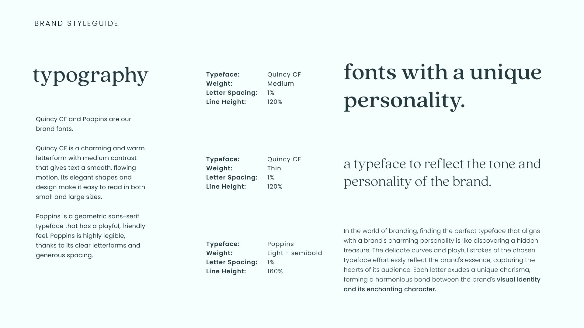
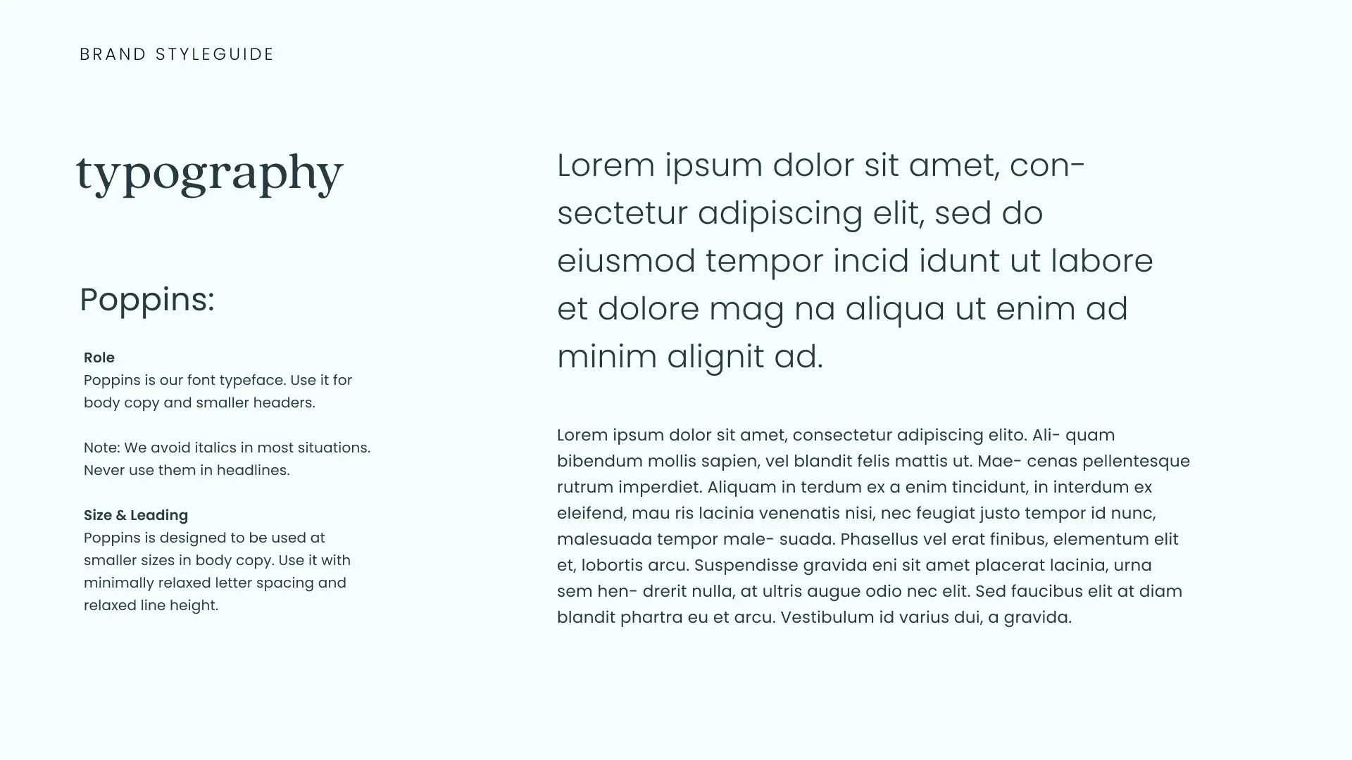
STYLE GUIDE