LinkedIn Wellness Logo Refresh
LEAD DESIGNER + ART DIRECTION
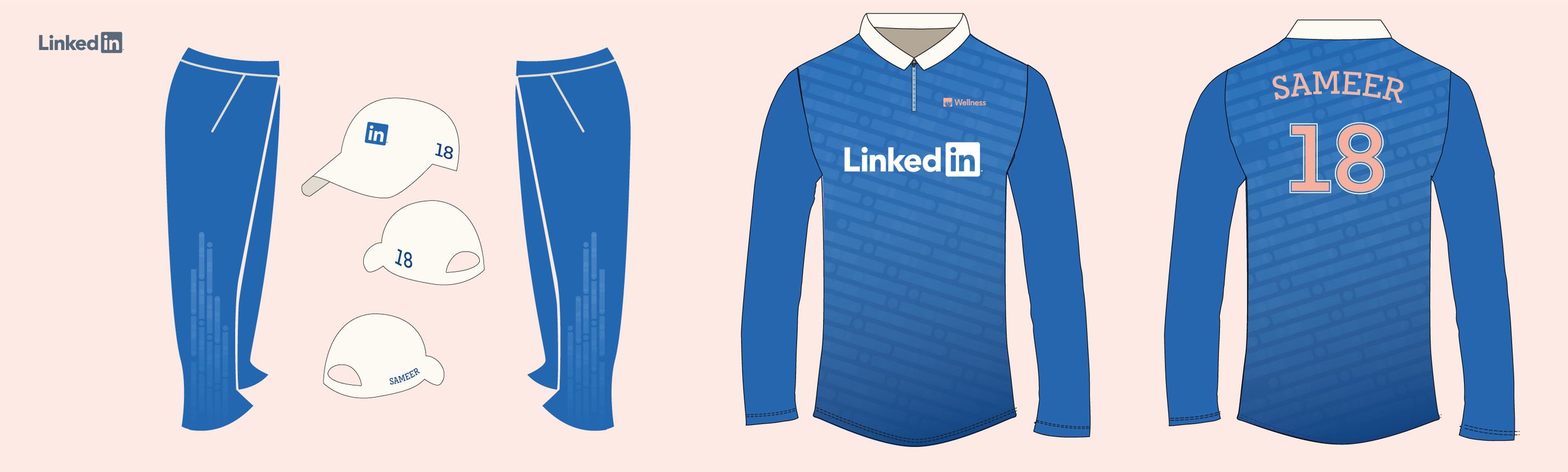
The motivation behind creating a new logo had two main objectives: to enhance engagement, and usability. My task was to design a logo that accurately conveyed the program's tone, voice, and progressive nature. Considering program engagement strategies among the relatively young LinkedIn demographic, I drew inspiration from iconic fashion brands that have simple, easily recognizable logos. I wanted people to want to rep our Wellness-branded merch. Items from the Wellness store are only attainable by redeeming Wellness Points (which are earned from participating in the program)—the dangling carrot to broaden audience engagement. Obviously the new logo must be compatible with multiple formats, instances, and communication channels, such as print, SWAG, digital, motion graphics, etc.

THE PROBLEM
• The old logo was too busy
• It lost readability when scaled down
• And it wasn’t consistent with evolved Wellness brand.
RESEARCH
Prior to designing, I was curious what other industry logos looked like and where there might be opportunity to stand out. Noteworthy trends included motifs featuring lotus flowers, circular designs, and playful strokes.


KEY WORDS
Before designing, we identified a few program attributes to inform design decisions.
Well-being
Transformation
Potential
Intentional
Fun or “light”
Engaging
Innovative
Compassionate
Holistic
Educating
TONE & FEEL
While staying connected to the overarching LinkedIn brand, the new logo should evoke a feeling of wellness and transformation. A notable aspect of the LinkedIn Wellness program lies in its innovative approach to employee education. Therefore, I aimed for the new logo to give a light nod to its tech-influenced environment.


ART DIRECTION
The analogy we like to use to describe the Wellness program and the six tenets is that of growing a plant. For a plant to flourish it requires three things; sunlight, soil, and water. Humans are more dynamic than a plant and require a bit more to flourish. Enter the 6 Tenets–Thoughts, Breathing, Hydration, Nutrition, Movement, and Rest.
In setting out to create a new logo, I wanted the design to reflect the 6 Tenets of Wellness and symbolize the mission and values of the program.

THE NEW LOGO
To distinguish itself from other wellness organizations and resonate with a younger audience, this logo needed a touch of technology. The LinkedIn “in” bug incorporates an agave or aloe vera plant in its negative space, symbolizing healing and resilience—qualities associated with a robust wellness practice. The plant shape features six leaves, aligning with each tenet.
The plant logomark serves as the visual anchor, while the typeface’s increased weight enhances readability.
LOGO VARIATIONS
The new logo works with light and dark backgrounds depending on the application.
When space is limited, a stacked option can be considered.
THE LOGO IN MARKETING ACTION
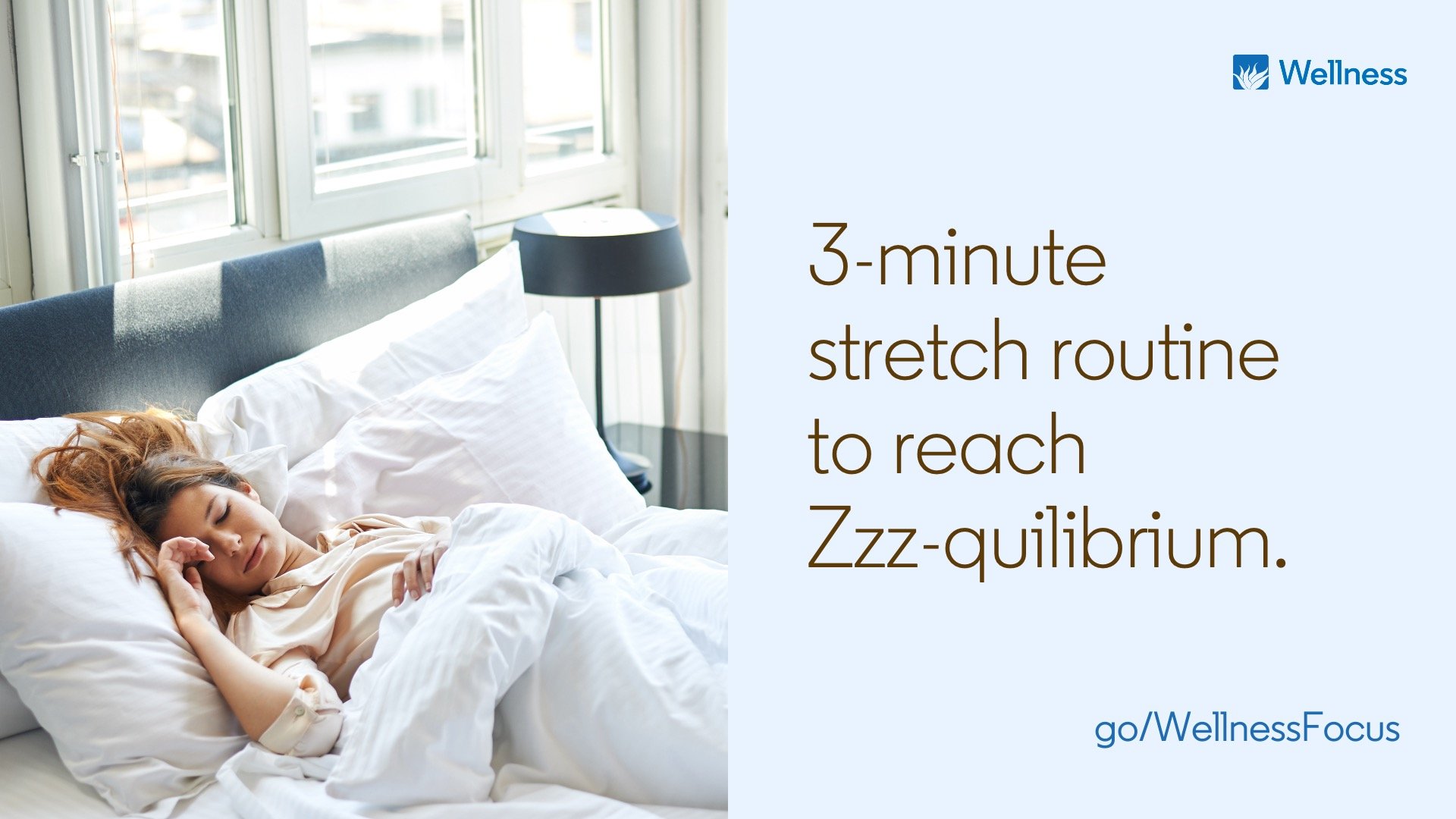
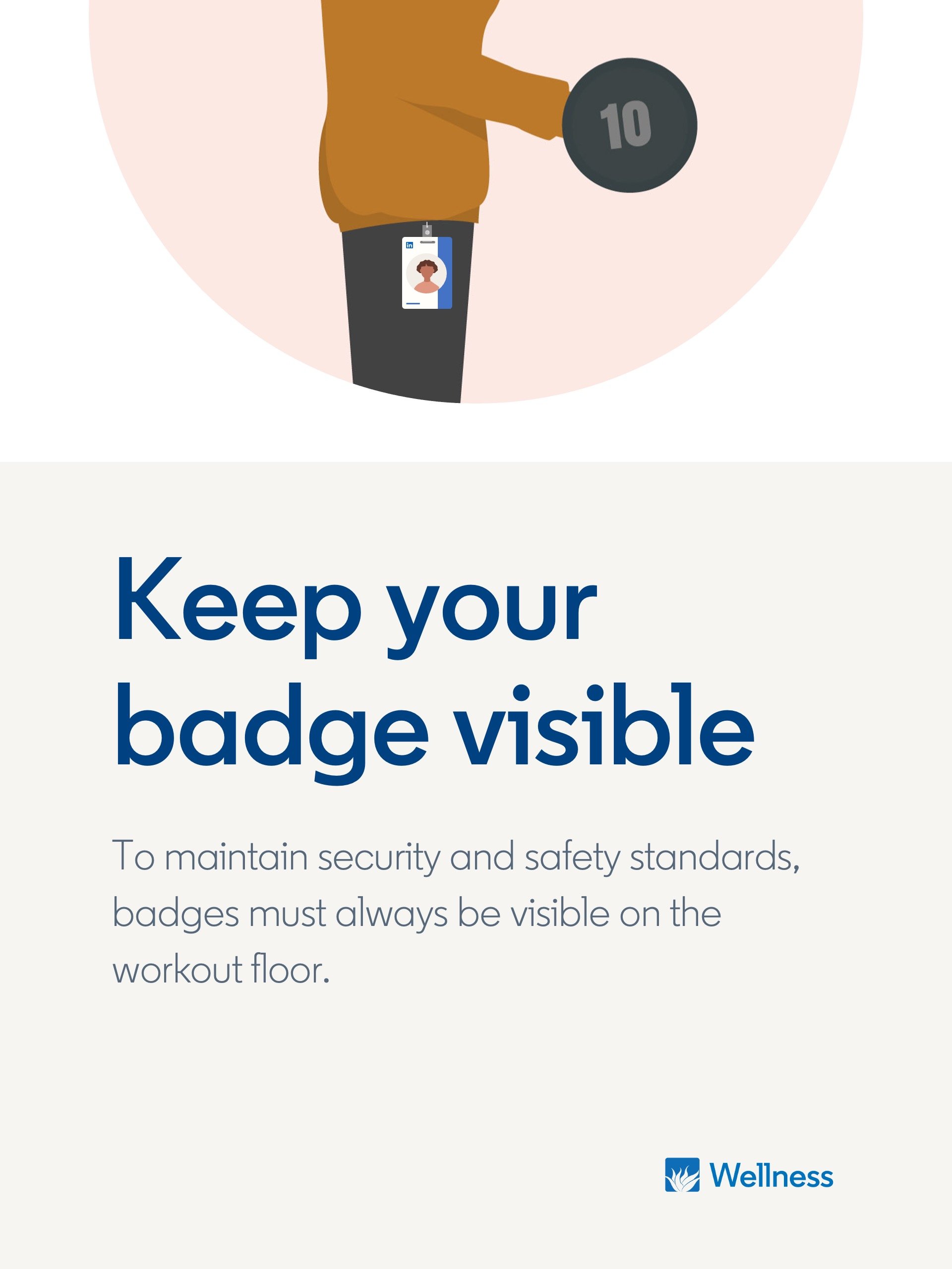
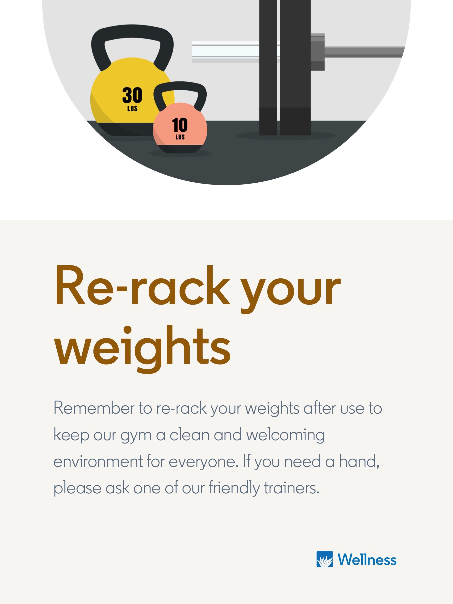
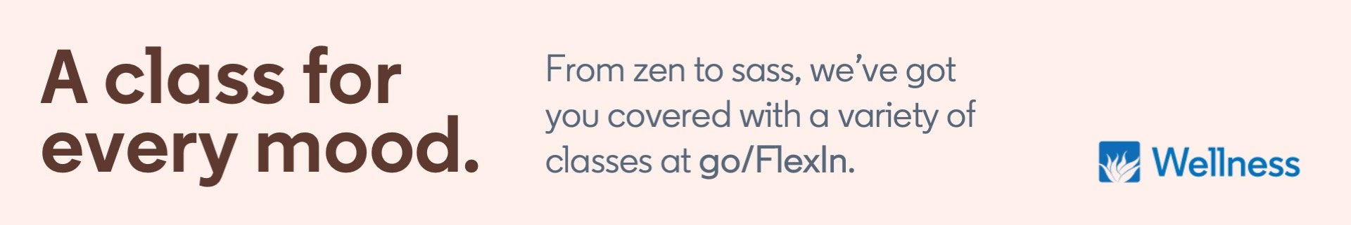
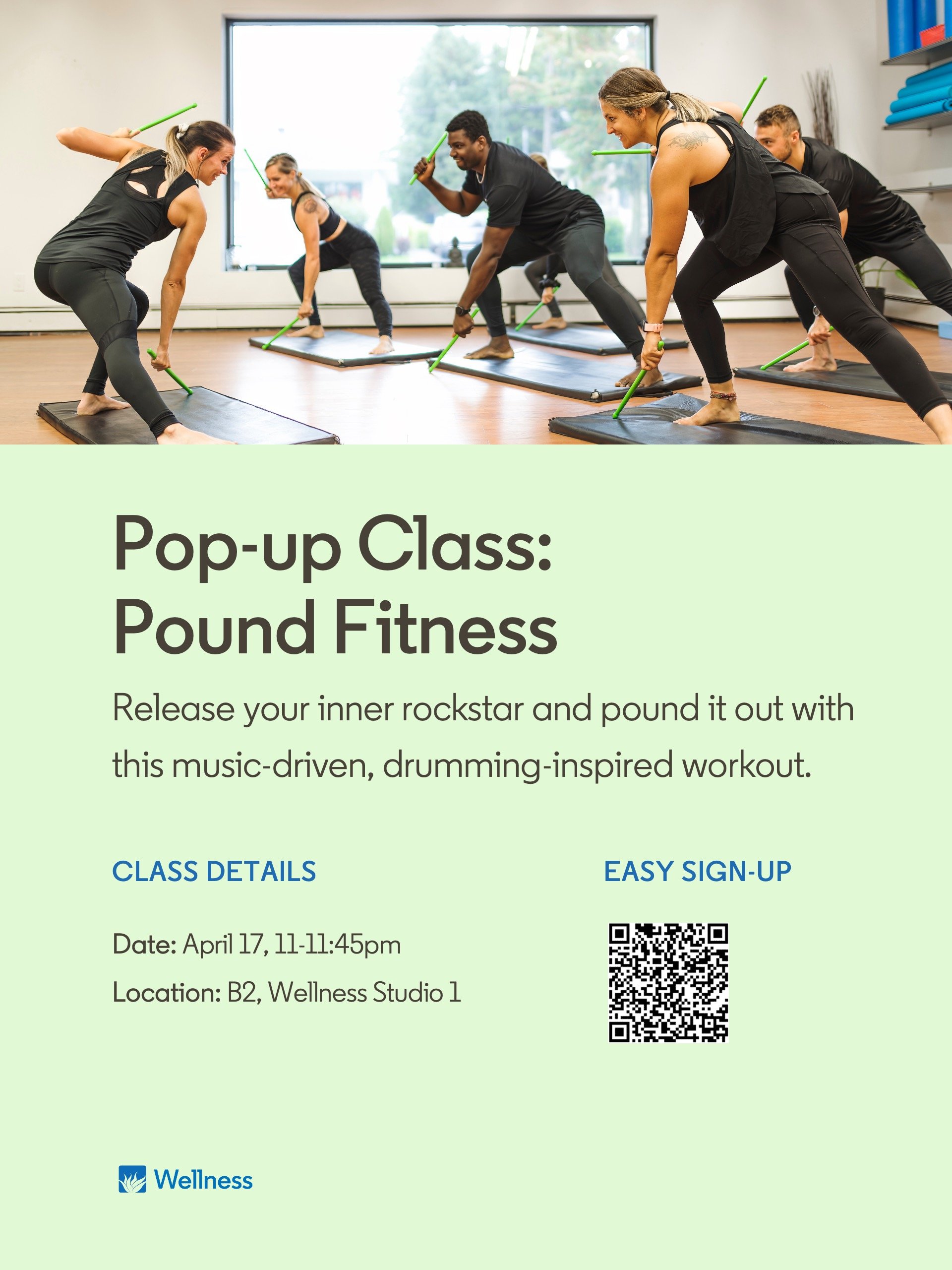
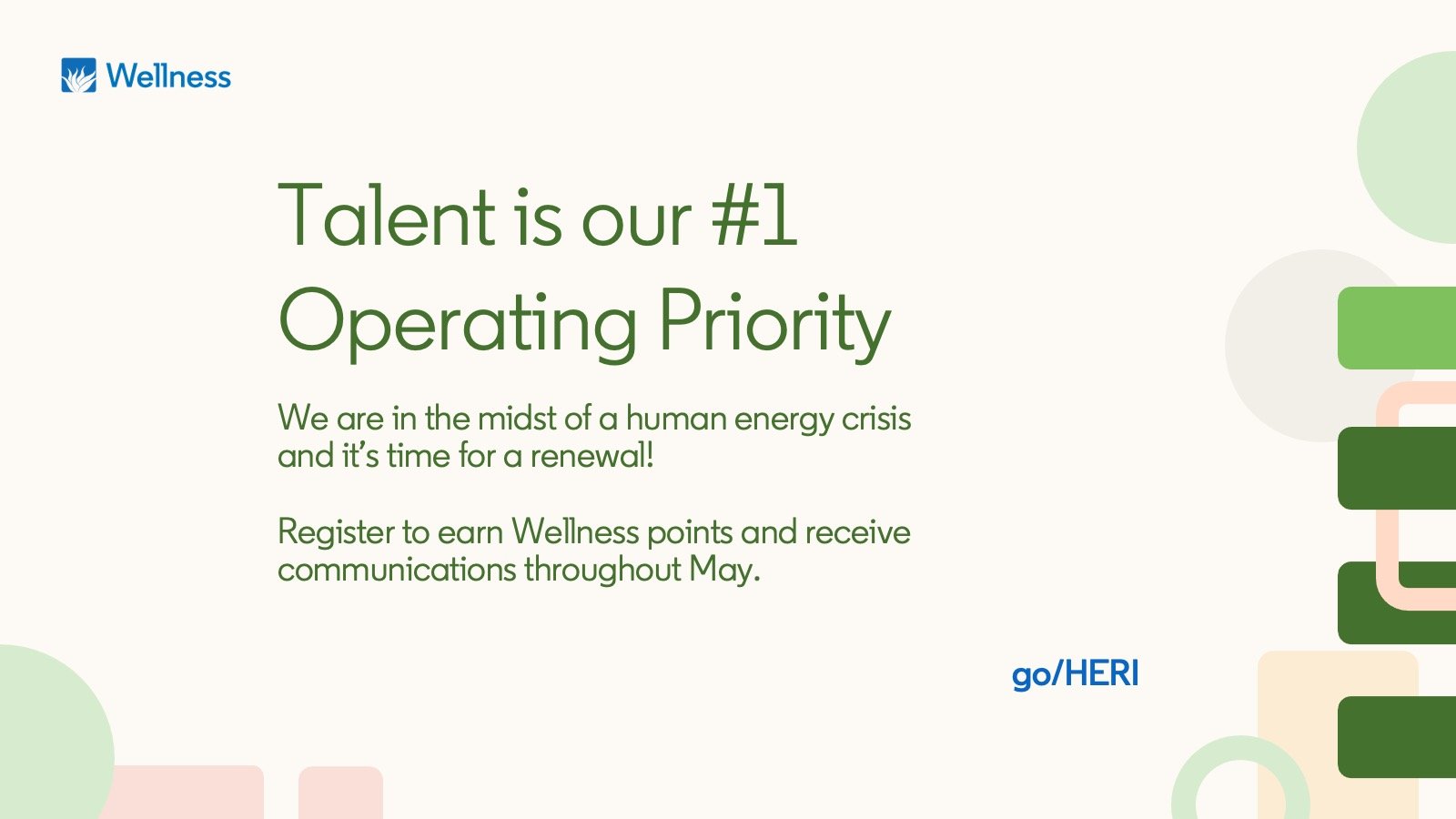
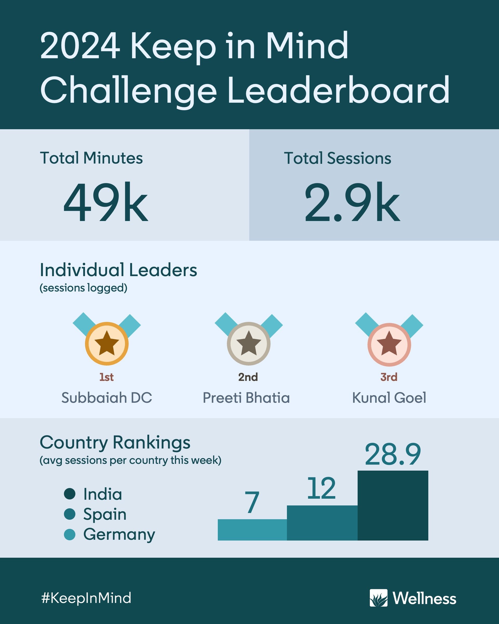
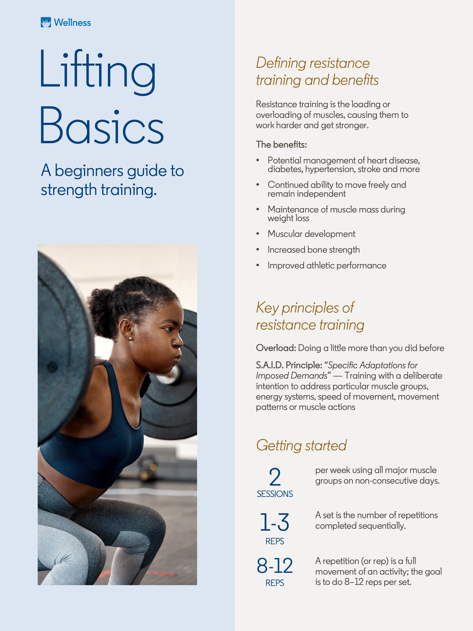
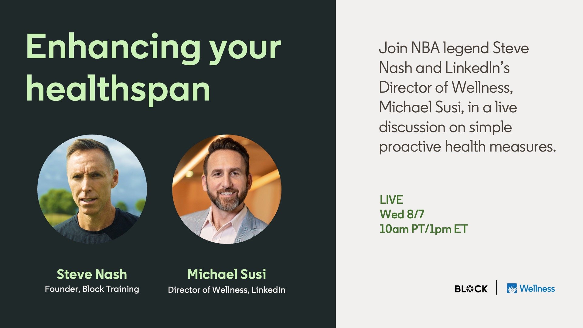
Now, please enjoy a smattering of things the Wellness logo has touched or lived on, including social posts, digital display ads, physical event banners, printed handouts and the like—Which, if we’re taking credit for things, were also created by me.